The Brief History of This Homepage's Development
Over the past few years, many working hours have gone into this homepage and numerous articles have been added or changed. Likewise, the topics and design have been adjusted and restructured on several occasions.
The following screenshots show the developments and changes in the design of this homepage over the past years.
Homepage Design from 28.03.2026
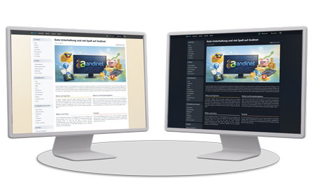
With the design update from March 2026, Andinet was once again modernized and further technically optimized. The new layout provides a clearer structure and an overall more contemporary appearance.
Particular focus was placed on better support for different display sizes, meaning the site is now displayed much more harmoniously on large screens as well as on smaller devices. Additionally, a light and dark theme was integrated to enable a more comfortable experience depending on the environment and personal preference.
Homepage Design from 29.10.2020
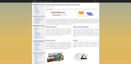
With the design update from October 2020, the Andinet start page was made even more modern, cleaner and broader in terms of topics. The new look connects the different areas of the homepage — from jokes and puzzles to pictures and technology through to downloads, tips and financial intelligence — in a unified, fresh look.
In addition, new topic areas were added, in particular tips and guides on the subject of finances, significantly expanding the site's content.
Homepage Design from 17.04.2019
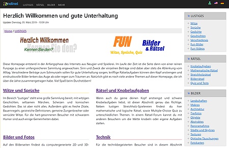
The last step towards responsive design was heading in the right direction. However, the website had become very large and sluggish due to the frameworks used (Bootstrap, jquery, fonts...). It was not uncommon for more than 1MB of data to have to be downloaded for a single page load. Therefore, the custom CMS was improved again and is now based solely on the minimal CSS framework MINCSS, which was additionally heavily adapted to the needs of Andinet.
A further step towards greater speed: Almost all pages are now only regenerated on the server when changes are made and are no longer dynamically generated on every request (static HTML). What this achieves is shown by a benchmark test.
Additionally, lightbox galleries are now supported for the image pages (thanks to baguetteBox.js), allowing convenient viewing in full-screen mode.
Homepage Design from 03.07.2016
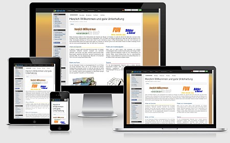
The moment has finally arrived: "Andinet goes responsive"! The new update to Andinet.de in 2016 brings back dynamic size adjustments of website elements and uses a modern design. This means the pages can be displayed ideally on small, mobile devices such as smartphones, iPhones or tablets, as well as on fast desktop computers and TVs with large displays. The layout is designed to be so flexible that it offers consistent usability on all devices – the page content adapts dynamically. Thanks to the newly introduced CSS framework Bootstrap, all pages also get a uniform look.
With the new user login, visitors can leave comments and contributions more easily and quickly, and use additional features.
Also as part of this update: new images, new jokes, new quotes, new rhymes and many new, funny texts.
Homepage Design from 06.11.2010
After the design had changed very little or not at all over the past few years, there was a complete redesign in November 2010.
In order to better control the presentation of individual pages, I no longer adhered to the dynamic HTML concept, but instead created a completely new framework. As is now common with most websites, the new design uses a fixed width and no longer adapts dynamically to the browser window width. In return, all pages can be better optimized for the known size.
Of course, with the redesign I also added new content and pages right away.
More pictures, more jokes, more puzzles, more information...
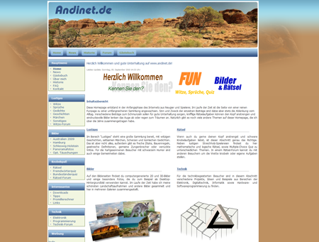
Homepage Design from 10.10.2009
In the following years, little changed in the homepage design and there were only minor updates here and there. However, since the changed domain www.as3.de was not able to establish itself properly with search engines like Google, I reintroduced the good old domain www.andinet.de in October 2009.
Along with the new logo, the pictures section was also expanded, as I had discovered photography as a hobby.
At the same time, I developed the cheerful online blood alcohol calculator on a rainy weekend.
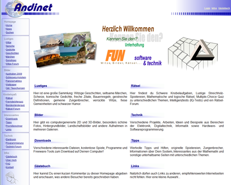
Homepage Design from 09.10.2005
Almost a year later I optimized the design again somewhat. Since the menu bar had so far only been arranged at the top, space for new sections was gradually running out and I decided to extend the menu from the top to the left edge.
At the same time I also added new topics to the site, such as electronics and programming. The German states quiz and the foreign words quiz were also added.
Otherwise the appearance remained fundamentally very similar, the logo showed the complete globe in the background, but the color composition remained unchanged.
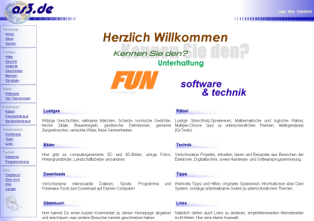
Homepage Design from 12.12.2004
After a long pause and few changes to the design and content due to provider/traffic problems and my very time-consuming studies, it wasn't until 2004 that there was finally a rebuild.
The division of the page into individual "frames" for the menu and content has disappeared, and accessing a homepage directly on a subpage (e.g. via a search engine link) is no longer a problem.
The biggest innovation, however, is the switch from pure HTML to PHP. All pages are dynamically generated and assembled.
Added to this is a new guestbook and various statistics functions including a visitor/page access counter.
I had also shortened the domain: www.as3.de
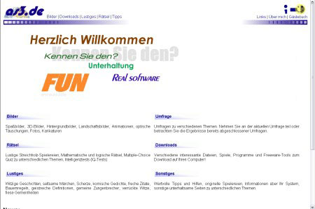
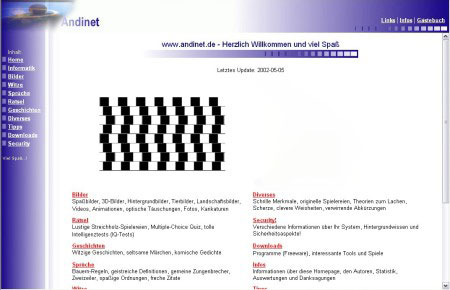
Homepage Design from 05.05.2002
Again about a year later I designed a completely new design for the homepage. I wanted to tone down the playful look and typical image of a "fun" page and also include other topic areas such as computer science/technology basics or a security section.
As many people said, the homepage had "grown up".
I kept the basic layout (the menu frame on the left/top, the individual pages in the middle), but all graphics were replaced and made more consistent.
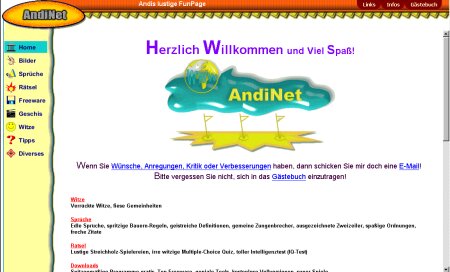
Homepage Design from 12.02.2001
Hardly had the last design changes been made when I increasingly received feedback from visitors criticizing the yellow background: reading was annoying and unnecessarily tiring.
As can be seen in the screenshot, I did something about it and once again changed the background.
In terms of content, hardly any new features were added.
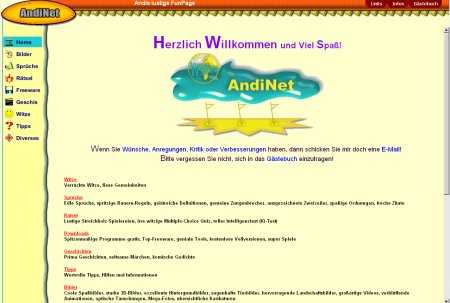
Homepage Design from 02.12.2000
Towards the end of the year there was another change to the homepage design. The structure of the individual pages remained almost identical, only the background was varied again.
As a significant new feature there was a new navigation menu - graphically polished and revised.
The scattered, rather plain "flat buttons" gave way to a more original frame with an integrated logo.
Curtain up: AndiNet is here!
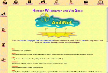
Homepage Design from 20.01.2000
The screenshot alongside shows the new 2000 design. As the homepage gained more and more content and new sections became necessary, a new "frame border" with additional buttons was added on the left edge of the screen. The background was slightly toned down and the start page completely renewed. The long welcome text fell victim to the renovation and was replaced by an appealing logo.
I also deepened my Perl/CGI knowledge and programmed my own guestbook adapted to the design.
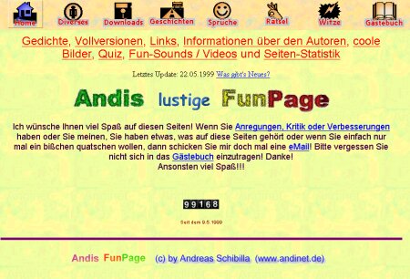
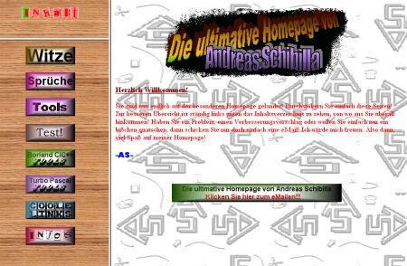
Homepage Design from 22.05.1999
This was just a small extension of the existing design. I had finally toned down the terrible background and added a new logo lettering.
Additionally, a detailed page and visitor statistics provided by the hosting provider and the own domain "www.andinet.de" were added. My counter was approaching nearly 100,000 visitors.... *proud*
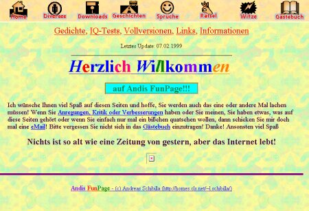
Homepage Design from 07.02.1999
Particularly striking about this design is the unbearable background. My goal was to make the page a bit more vibrant again - unfortunately not entirely successful! The start page turned out far too colorful and the text was hard to read against the background.
In contrast, the new button bar at the top of the screen turned out better. Inspired by the then-current browsers with their new "flat toolbars", my buttons also made use of the "mouse-over effect" again.
The catchy slogan "Nothing is as old as yesterday's newspaper, but the internet lives!" unfortunately gets a little lost...
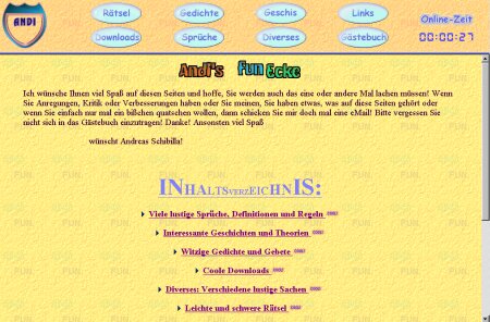
Homepage Design from 18.10.1998
The next change came just a few months later. The most important difference from the old version was the renewed division of the homepage into a menu frame and a main frame. In the upper menu frame there are large, clear buttons for the individual sections, which could change color when hovered over with the mouse.
In the top right corner, a current online timer was also added, intended to inform visitors how long they had already been on the homepage. Of course, a scrolling ticker on the start page was also a must, with the welcome text scrolling in from the left. Besides these overly playful effects, there were hardly any new additions to the actual content. But I had made my first experiences with JavaScript :-)
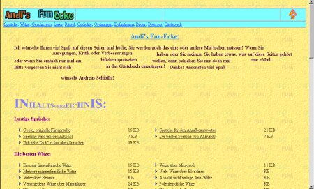
Homepage Design from 22.07.1998
About a year later, after I had gathered my first experiences with HTML, the homepage already looked completely different. The three "frames" had merged back into a single page, and the navigation was somewhat clearer and less playful. Along the way I had collected and integrated more and more funny texts, images etc.
As a special feature, a guestbook was finally added, which my hosting provider at the time had made available to me.
Homepage Design from 24.11.1997
This was one of the first versions of my homepage. Back then I was very proud, as a school student, to already have my own website. To make that clear, almost every page featured a large logo with a copyright inscription :-))
As can be seen in the screenshot, the design was very colorful, cluttered and tiring to read. But as is typical for beginners, I too had to try out countless features of various programs.
The homepage was divided into three frames, which could be resized with the mouse. The logo in the top left corner was already animated, with each letter being displayed individually for a brief moment with a green background.
Every beginning is difficult - but it's also fun!
Comments 0
Write new comment: